The Slowing Housing Sector
The reason we chose to look at this sector of the economy is threefold:
1). It was the catalyst[1] for the previous recession and financial crisis
2). The sector is not nominally impacted by the China trade war
3). It tends to show aging/topping before other sectors because of interest rate sensitivity
We would like to emphasize the second point. There has been a lot of speculation and optimistic chatter about the seemingly elusive China trade deal. At DAM we are attempting to ignore the noise and look under those rocks that people never seem to want to turn over. The housing market is not impacted by a positive outcome with China, nor is it negatively impacted by the trade war in the first place. There has been so much hype and expectation that the economy will “snap back” to place once the deal is *finally* resolved.
However, there are sectors (important ones, at that) which are beginning to tire and are showing forewarning signs of weakness; the housing sector is no exception. Please understand we are not trying to imply there will be another mortgage crisis, merely that the housing market is slowing, which tends to be a leading indicator of an economic downturn. It is also interesting to take note that these signs of weakness did not show up in 2015/16 when the economy most recently experienced slowing growth (bear in mind interest rates were lower then). It goes to show how sensitive our credit- and debt-based economy is to even minor increases in interest rates. Enough of this though, let’s dive into the data.
For those of you we communicate with on a regular basis, you know we have speculated that a significant portion of the housing market recovery has been fueled by low rates and investment dollars, not consumer/individual purchasing dollars. The introduction of investors to the single-family home rental business is relatively new which became prevalent post 2000 as mortgage rates persisted below 7%[2]. We were finally able to scrounge up some data which confirms our thesis. The last 10 years of housing sector growth has been dominated by investment dollars.
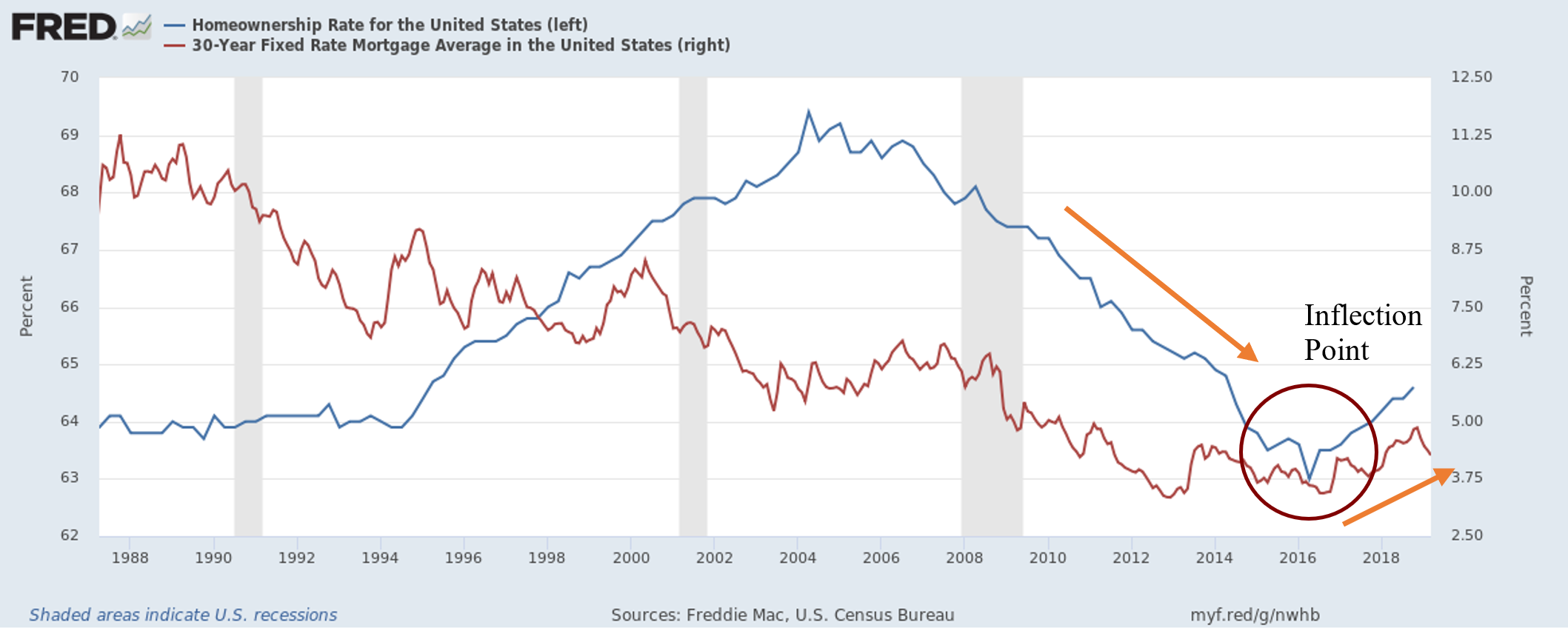
Investors dominate the market, pushing housing prices to exhaustive levels, raising rents, and pricing individual buyers out of the market. Who can blame them? It’s a good investment. The problem is the Federal Reserve artificially driving long-term interest rates down (through QE), enabling this once unheard-of practice to dominate the housing market (house-flipping is a phenomenon). This does not show underlying strength of the American consumer, but merely the strength of the single-family home real estate investor. Perpetually rising housing prices only squeezes the pockets of anyone who doesn’t already own a house and drives down the wealth of anyone who must rent in the meantime.
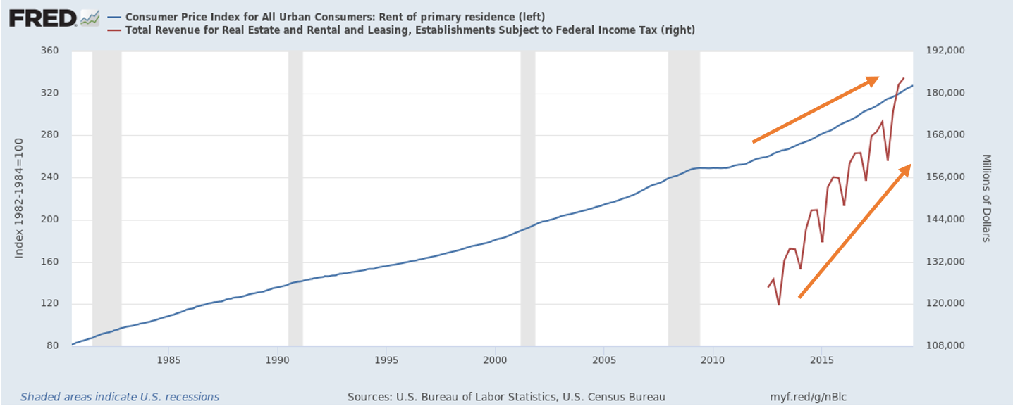
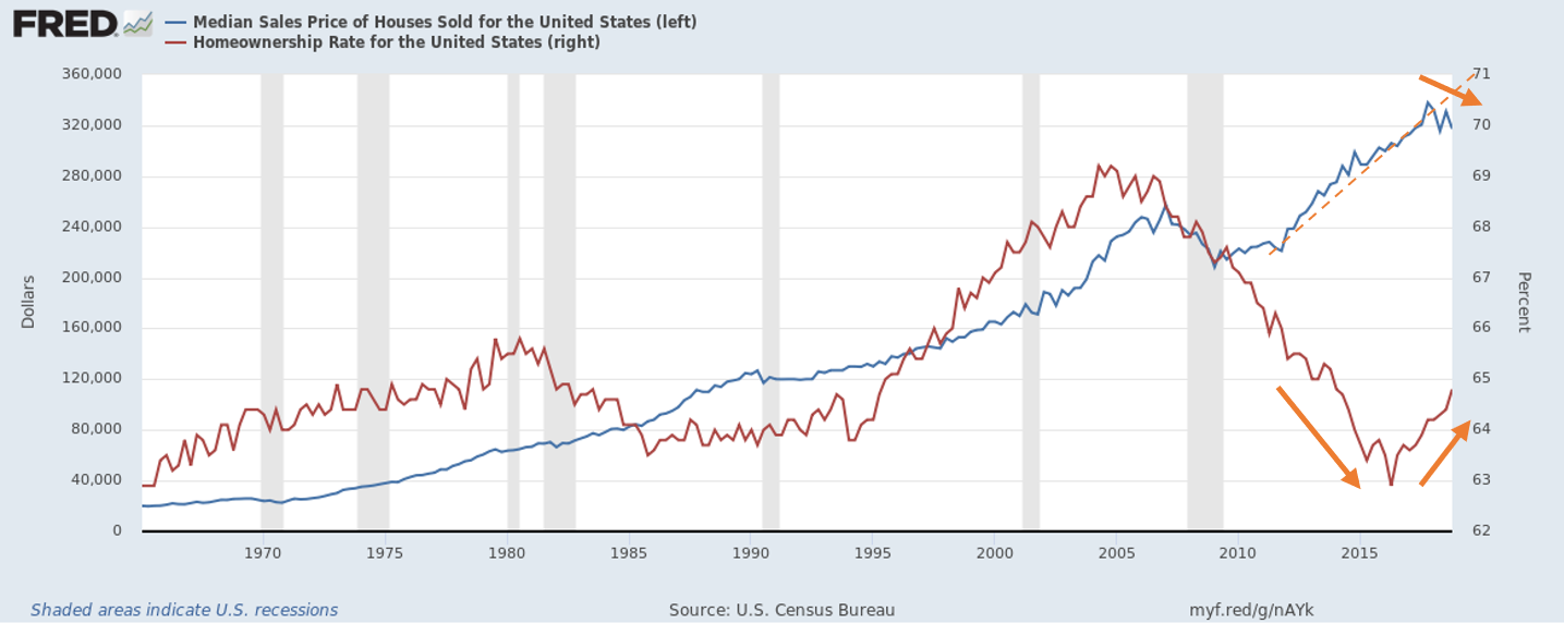
From the first graph presented, there became an obvious inflection point in 2016 (mortgage rates bottomed) when individual buyers began flooding the market again and real-estate investors were either being priced out or were finally being dominated in the statistics. This is critical since it comes at a time when housing prices are slowly starting to peak. It’s very interesting to see that when individual buyers can begin to “afford” homes again, investment dollars seem to be drying up, naturally making the value of housing drop (don’t worry, your rent is still increasing though!). The Case/Shiller home price index makes a notable flat-line at peak cycle. Now, this could easily be a datapoint that is simply a deviation from trend and is made-up for with the next mark, but it needs to be noted and kept in mind since it is indeed larger and notably downward compared to other deviations. Another interesting graph which shows the even greater topping nature of house prices (and individual dollars “buying at the top” as investment dollars have dried up), is shown below. The trend of median home sale prices has notably been broken and appears to have peaked, right as individuals begin to dominate the housing market and interest rates start to rise.
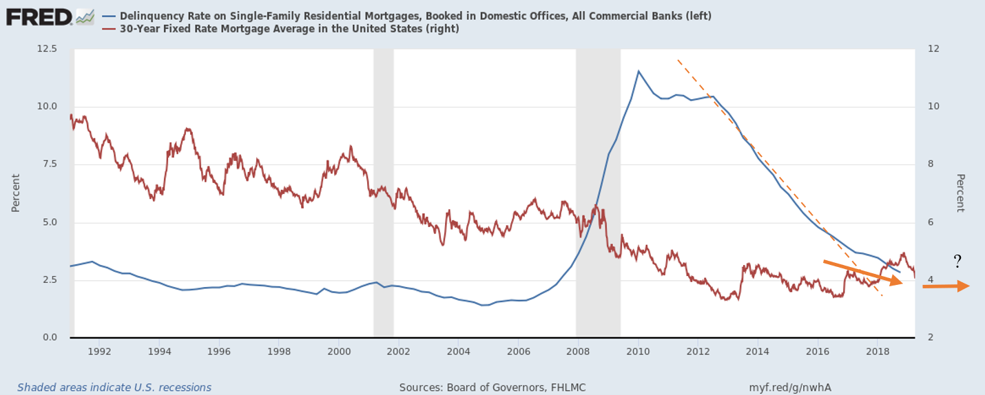
It is ever apparent the pace at which homes are flying off the market, as well as perpetually increasing in value, is slowing (and has potentially topped). As we mentioned earlier, we do not believe the housing market will have another crisis, but it will experience hardship like any other sector when a recession eventually does occur. The delinquency rate and debt service payments as a percentage of income have both shown strength in trend and direction since ’08. However, think of the economy as a train which takes time to turn around or even break its directional momentum. Small deviations, especially in trends, can signal in a change in direction. The figure below shows the current strength in delinquency rates on single family homes. However, when mortgage rates began to poke their head above the 4% mark in late 2016, the trend was broken – the train had slowed. This has continued to show significant signs of trend slowing and potential bottoming. It should also be noted this rate never returned to the levels seen before the last crisis. Interesting.
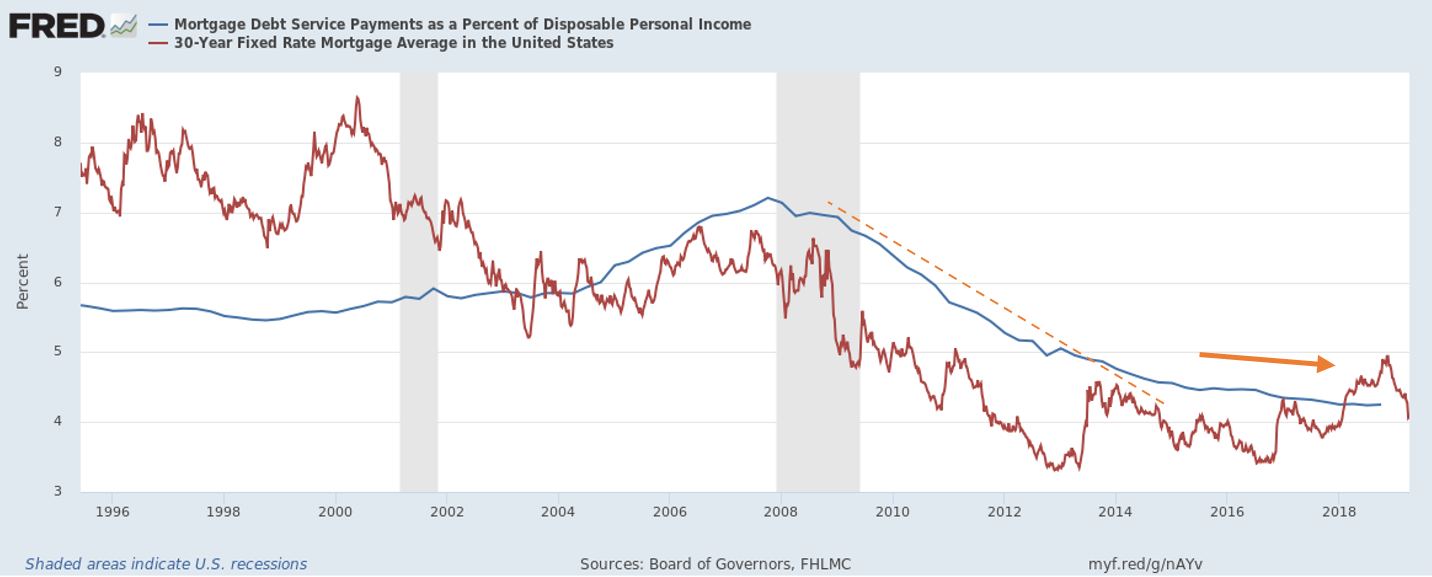
The debt service payments as a percentage of disposable income has significantly flattened, shown below, which is evidently impacted by higher/rising mortgage rates. It really is remarkable to see just how sensitive our economy is to an increase in interest rates… Really does not show much underlying strength or resiliency in the so-called “boom” of a recovery. Call me skeptical.
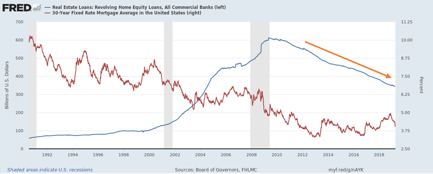
The additional graph below shows revolving home equity loans against the 30-year mortgage rate (notice how we overlay that onto a number of these graphs since it really shows the sensitivity of the sector to interest rates). While it is obvious that the glut in equity loans before the ’08 crisis has not been repeated, the debt-based investment into your own home has been slowing on a nominal basis. Frankly, this is a good sign in terms of any over-indebtedness of the individual household owner. Significantly reduces the likelihood of “going underwater” on your mortgage and home-equity loan in the event housing prices start to fall dramatically.
The next chart we will present has honestly been the most interesting and caused me to raise at least one (if not both) eyebrow(s). Remember, the economy and sectors are like a train, or even a snowball. A train takes awhile to turn around and a snowball doesn’t suddenly become an avalanche. By the time you realize the train has turned in the other direction, or an avalanche is upon you, it’s too late. Our mission is to find slight, yet significant in terms of potential impact, deviations in data which could be a signal that the train is turning, or a snowball could be an avalanche. Of course, this can generate false-positives, but investment and trading decisions can’t be made when the information is obvious – it’s simply too late by then.
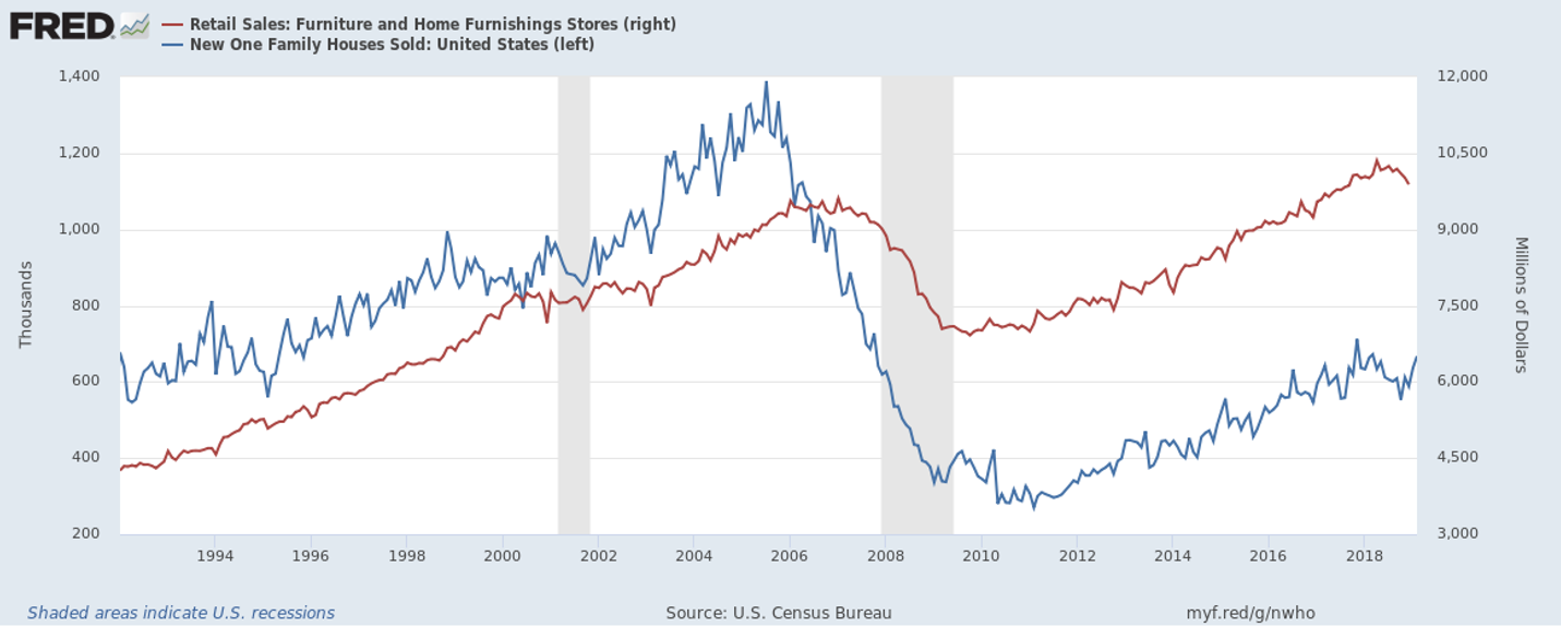
The chart shows a comparison between the number of single-family homes sold in the US, versus the retail sales from furniture/home furnishing stores. The number of homes sold acts as a leading indicator on the sector and even the overall economy. It has shown relative signs of weakness in the last few months, breaking from trend (let’s see if the next few weeks of data can get us to bounce-back within trend range). What’s most notable about this deviation, however, is the “confirming” indicator of the slowing data has already diverged from its upward trend. This confirming indicator is something we see clear as day in 1999/2000 and again in 2006/2007. What’s very interesting, is that it took at least a few months for the confirming indicator of the furnishing sales to diminish/break from trend after the number of family home sales began to slide. However, this year has proven different. The retail sales have already begun to slide within a month of the new home sales breaking from trend. To us, this simply confirms the present weakness of the American consumer.
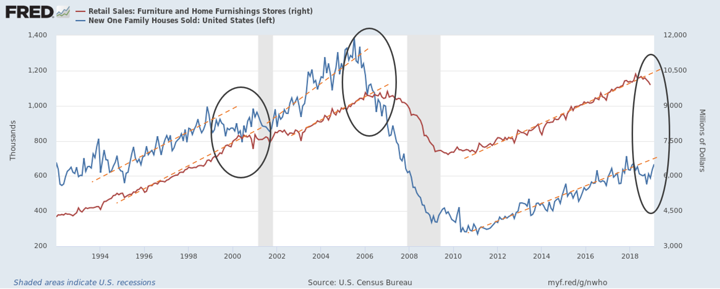
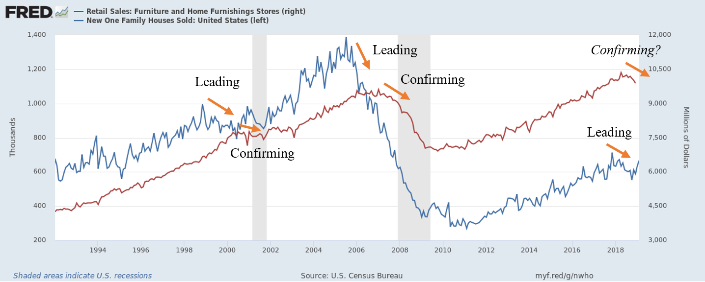
Please bear in mind, we are using this time frame because the nature of the single-family housing market has changed significantly since the 90s (as we mentioned, the increase in investment dollars) within the sector. While additional data will continue to either confirm or deny this development in the housing market, it certainly is data that makes you go, “hmmmm…”. Stay tuned and see if this “Confirming?” is transformed to “Confirming” or if it is a false indication and the housing sector posts a turnaround; i.e. the train isn’t turning around yet.
From this *relatively* brief analysis, we can draw conclusions that the housing market is indeed slowing. It is slow, steady, and only a little bit at a time, but the signs are certainly there. Not due to the trade war, not because of Brexit, just because of the good ‘ol domestic economy. It is interesting to see every major economy’s central bank blaming external factors for “uncertainty and headwinds” and citing a “very strong” domestic economy and “very strong” future growth prospects. If that’s the case, why is everyone pointing fingers at each other? As investors and prudent asset managers, it is our job to scratch our heads and start overturning rocks to see what’s really going on. Stay tuned as additional data for the economy and the housing sector is published. Remember, a train doesn’t magically turn around. It must slow down before it gets to the station, but as we all know, trains can quickly pick up momentum, no matter which way it’s going.
Interesting thought experiment:
There are two objects which share all these characteristics:
- Frequently purchased with debt/down-payment
- Practical daily usage
- Requires maintenance and upkeep
- Deteriorates significantly over time if left unattended
- Natural demand from other consumers for the objects
- Way to display wealth
- Appealing purchase for any income range
Where these two objects differ:
- One object, if left completely unattended/ignored, will slowly erode in value until it’s practically worthless
- The other object, if left completely unattended/ignored, will slowly increase in value until…?
This is interesting. One object is a car, and the other is a home[3]. This is very interesting to me and honestly a phenomenon within our reasonably known lifetimes. Why is it that these two practical objects share so many characteristics which should define its value, yet one will seemingly permanently increase in value, while the other erodes (all else being equal). Makes you scratch your head, doesn’t it?
[1] For those of you close to me in age looking at mortgages, could you imagine a 7% interest rate on a mortgage?? Times have changed, credit is cheap, and it seems increasingly more unaffordable the more expensive it becomes (i.e. ~5%).
[2] If you have read our newsletter, you are aware we believe it was not the cause, but the catalyst. These are fundamentally different.
[3] Not the land, but the structure itself. The home.
